Checklist of common accessibility errors found in new services
Version 1., published 2 August 2024.
Contents
- Design system code and patterns are correct
- HTML should validate
- Page titles should align with the main page heading
- Page titles should follow the GOV standard
- Error page titles should start with ‘Error:’
- Form inputs are linked to their labels
- Groups of inputs use fieldsets and legends
- Links in phase banner and footer make sense
- Provide autocomplete for commonly-entered information
- Conditional reveals should be simple questions
- Help or hint text is linked to the question label
- Check answers change links are not ambiguous
- Visually hidden text does not prevent voice control from working
- Feedback form is accessible
- Issues with the design system that cannot be fixed
- Accessibility statement issues
Design system code and patterns are correct
Check that you are using design system code and patterns correctly.
HTML should validate
You should do this simple check before any other checks. Use the HTML validator or browser developer tools. Consider adding HTML validation to your automated code lint.
Page titles should align with the main page heading
Check that all page titles are the same as the H1 unless there is a very good reason for them to be different. If they are different, then they should at least be be consistent.
For example, if the <h1> is “What is the name of the business?” then the <title> should also start with “What is the name of the business?”.
Check also that the page title is unique on the site or journey.
It's not uncommon to see every page have the same title and that would usually be an accessibility fail.
See also Page titles should follow the GOV standard.
Page titles should follow the GOV standard
The format for the page <title> should be:
{Page h1 heading text} - {Name of service} - GOV.UK
Error page titles should start with ‘Error:’
If you are displaying an error on the page, The format for the page <title> should be:
Error: {Page h1 heading text} - {Name of service} - GOV.UK
See Help users to recover from validation errors
Form inputs are linked to their labels
The for attribute of the label should be the same as the id of the input or textarea. See Text input on the Design System for an example.
Check also that you don’t have a duplicate id present. This can happen if you copy and paste elements. You can check for this by validating the page HTML.
Groups of inputs use fieldsets and legends
Radio buttons, groups of checkboxes, date inputs and groups of related inputs (for example an address) should be surrounded by a <fieldset> and have a <legend>.
Links in phase banner and footer make sense
Links should make sense out of context
Services quite often just link the text ‘feedback’ in the phase banner. If that link is read out in a list of links, it may not be clear.
Feedback link suggested code:
<span class="govuk-phase-banner__text">
    This is a new service.
        <a class="govuk-link"
        href="FORM-URL"
        target="_blank"
        rel="noopener noreferrer">
            Give feedback on the service (opens new tab)
        </a>
    to help improve it.
</span>
Links that open new tabs should state that
This issue is sometimes found throughout the service but we often see this in the phase banner and footer.
Depending on their behaviour, links should:
- not open a new window
- have “(opens new tab)” at the end of and as part of the link text
Provide autocomplete for commonly-entered information
Use the autocomplete attribute on text inputs so browsers can autofill the information on a user’s behalf if they’ve entered it previously.
See Use the autocomplete attribute in the Design System.
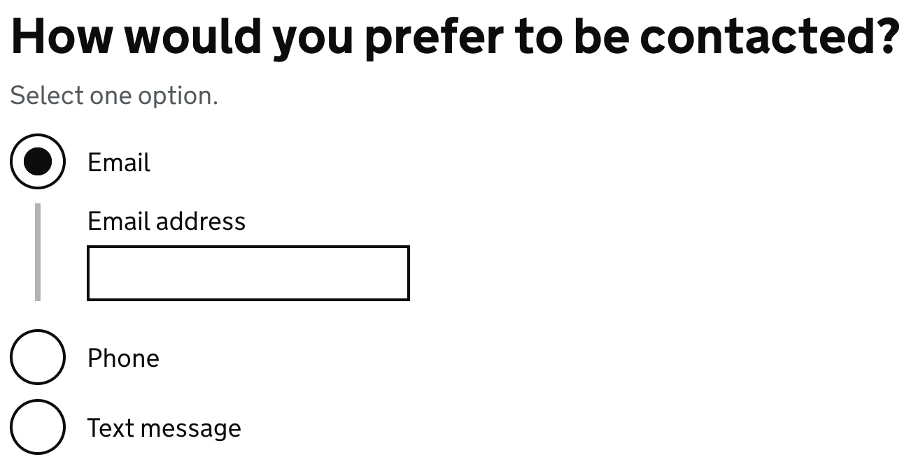
Conditional reveals should be simple questions
Conditional reveals do not automatically fail WCAG 2.2 provided that you follow these guidelines:
- Keep it simple. If the related question is complicated or has more than one part, show it on the next page in the process instead.
- Do not conditionally reveal questions to inline radios, such as ‘yes’ and ‘no’ options placed next to each other.
- Conditionally reveal questions only - do not show or hide anything that is not a question.
See Conditionally revealing a related question.
Help or hint text is linked to the question label
Where your question has help or hint text you should help screen reader users to find it by linking it to the <label> using aria-describedby.
For example:
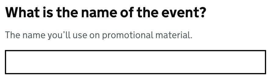
The relevant HTML is:
<h1 class="govuk-label-wrapper">
    <label class="govuk-label govuk-label--l"
    for="event-name">
        What is the name of the event?
    </label>
</h1>
<div id="event-name-hint" class="govuk-hint">
    The name you’ll use on promotional material.
</div>
<input class="govuk-input" id="event-name" name="event-name" type="text" aria-describedby="event-name-hint">
There are different techniques for other input types - see the Design System components for more information.
Complex help text
Do not use complex paragraphs, links or expanding <details> in the help text.
While screen readers will read out the link text when describing the field, they will not tell users the text is a link.
If you use a <details> element in your help text our testing shows that when used in an aria-describedby, the hidden content in <details> will not be read until it has been expanded.
See asking complex questions without using hint text.
Check that answer change links are not ambiguous
The Check answers pattern uses “Change” links to allow the users to change an answer. For example:

Screen reader users need to know what each link does so make sure that visually hidden text is being used to include extra text. This text should match the text at the start of the row so that it is consistent for voice control users.
Visually hidden text does not prevent voice control from working
If you use a link and include visually hidden text that is hard to guess, voice control users may find it hard to activate the link - for example:
<a class="govuk-link" href="URL">
    Cancel
    <span class="govuk-visually-hidden">
        and return to GOV.UK
    </span>
</a>

</span>
It’s better to include all of the text in the link - for example: Cancel and return to GOV.UK.
<a class="govuk-link" href="URL">
    Cancel and return to GOV.UK
</a>
Do not include hidden text at the start of a link or button - for example do not do:
<a class="govuk-link" href="URL">
    <span class="govuk-visually-hidden">
        Return to
    </span>
    GOV.UK
</a>
Feedback form is accessible
If you use a feedback form, it’s part of your service and should be accessible. If there are issues, they should be listed in your accessibility statement.
If you use Qualtrics, make sure you use the Defra Accessibility Team Qualtrics template and follow the guidance for building a more accessible Qualtrics form.
Add an email address at the top of your form for anyone who cannot use the form.
Issues with the design system that cannot be fixed
Invalid aria-expanded error
This applies where you show an input conditionally based on selecting a radio button. For example:
Accessibility testing will usually report an error - something like “aria-expanded is not a valid aria attribute”.
This is the current design system code. See Checkboxes in the Design System and the GitHub checkboxes note.
There is no need to list this issue your accessibility statement.
Heading 1 JAWS bug
If you are using the h1 as the legend inside a fieldset, JAWS users will not be able to find the heading. This is a known bug.
You should add the following text to your accessibility statement under ‘How accessible this website is’. There is no need to list it as a non-compliance under ‘Technical information about this website’s accessibility’:
If you use JAWS screen reader, you will not be able to find some form question headings due to a bug with JAWS. You will still be able to use the service easily but not list the headings on the affected pages.
Accessibility statement issues
Check that the statement matches the current GDS template
Sample accessibility statement
Check that you have not removed or changed the text that is required by the law.
The ‘what you can do section’ is correct for your site
The bullet point list under “that means you should be able to” is not a fixed list. You should ensure that it is correct for your website. For example, the 300% claim in ‘zoom in up to 300% without the text spilling off the screen’ should match what you have tested. If you are claiming compliance with reflow, then the figure should be at least 400%.
Non-conformances have a fix date
For each non-compliance you should say when you plan to fix it.
You claim disproportionate burden without doing an assessment
You should not claim a disproportionate burden for a new service.
If you do, this should be for a limited time and not forever.
You should have a written assessment.
You should check this claim with your legal advisors.