Improve social media accessibility
Version 1.0, published 16 June 2022.
Adapted and extended from Improving Your tweet Accessibility by Adrian Roselli
Checklist
- Do not use social media as the only way to spread key information such as emergency information, jobs, consultations, policy announcements etc.
- Write using clear language and avoid jargon.
- Make sure it is easy to identify the order of tweets in a thread.
- Use real words in hashtags and capitalise the first letter of each word.
- Avoid using emoji altogether or avoid using too many emoji.
- If you use emoji, make sure you know what the default alt text is for each emoji so you know if they make sense if read as text.
- Do not use emoji at the start of a line.
- Only use the default font. Check that there are no false bold or italic or special fonts.
- Check the colour contrast for images with text or drawings..
- Every image you use must have appropriate alternative text. Do not rely on any automated alt text.
- Check that alt text is helpful and genuinely descriptive.
- Only use video if it is necessary and an image will not do.
- Include captions and audio descriptions in video as necessary.
- Make sure your Twitter theme colour has good colour contrast.
Other resources
- Planning, creating and publishing accessible social media campaigns - Government Communication Service (GCS)
- Social media playbook - Government Digital Service
- Accessible Social - free resource hub by Alexa Heinrich
When to use social media
Do not use social media as the only way to spread important information.
Most social media apps and websites such as Twitter, LinkedIn and Facebook are not fully accessible. It would be discriminatory to give advantage to a subset of people who enjoy easy access to these channels. For that reason, avoid using social media alone to release key information such as emergency information, jobs, consultations, policy announcements etc.
Reason: taking Twitter as an example, in 2020, it had around 16 million users out of an adult population of 53 million - so 70% are NOT on Twitter. In addition, some users will not be able to use it as it is not fully accessible. Recently Twitter has started blocking non-logged-in visitors from reading more than a handful of tweets.
Words
Use clear language
Just like any other content, avoid jargon and write the tweet using clear language.
Content order
Tweets and brief social media posts are short, so content order is not as critical as for other content formats. However, we don’t want to waste the user’s time.
Bear in mind that Defra is a public body and not a company marketing its services and so on balance, aim to place key information in the tweet and do not force the user to hunt for it.
Consider putting the key information first and avoid using a mysterious ‘hook’ or a story format. However, starting tweets or posts with a question may help with engagement. It is OK to do that if the following sentence explains the answer or the linked content answers the question.
Reason: for people using assistive technology, scanning social media for key content may not be possible (no headings) and it might be slightly slower for them to decide if they are interested in the content if you leave the important stuff until last.
Twitter threads - formatting sequences of tweets
- Tell users that the first tweet is part of a thread. For example:
- This is a thread about how Defra …
- Defra has over 100 ways to protect our environment (a thread)
- Add a sequence number to each tweet:
- If you know how many tweets are in the thread, use the format “page of total pages” - for example 5 of 8 at the end of the tweet.
- If you are unsure of the total number, use a tweet number and a slash - eg 5/ at the end of the tweet.
- Add a number to the start of each tweet after the first, to make a numbered list - for example: 5. Defra stops pollution by…
Hashtags
Use real words and capitalise the first letter of each word (often called ‘camelCase').
Twitter hashtags are not case sensitive so it is safe to take an existing hashtag and capitalise the first letter of each word.
Example: #ClimateChange not #climatechange or #clim8chnge
Reason - it’s more readable for everyone; more likely to be read out correctly by screen readers; improves correct re-typing.
Using existing hashtags that do not follow the real word rule
If there are important hashtags that already exist that do not use real words, then consider the following:
- Avoid using the hashtag in place of words in a sentence.
For example write “Defra publishes new accessibility resources. #ally”
not “Defra publishes new #ally resources.” - Capitalise any hashtags that are abbreviations. For example write #UCD not #ucd.
Emoji
Avoid using emoji altogether or avoid using too many emoji.
Check that the emoji read as text makes sense. You can use Emojipedia to find the text equivalent of the emoji.
Do not use an emoji at the start of a line.
Example:
![]() Defra announces its new climate change policy.
Defra announces its new climate change policy.
May read as “graphic emoji leaf fluttering in wind colon Defra announces its new climate change policy”
Reason for using with care: they are very verbose in screen readers and the text read out may not make sense; different screen sizes may make them hard to see; different cultural backgrounds can change their meaning.
Images
Text size on images
If you add text to an image, make sure that the text size is large enough that it is readable on a mobile screen. It is not acceptable to use alt text to compensate for small text size.
You should aim to make the text size in scaled down images appear as 14pt - preferably larger. This will mean you need to make it much bigger in the original image, so it looks like 14pt when it scales down for mobile.
If you make an image that is 1600 pixels wide, on a mobile it will display at about 375 pixels. So if you use 14pt in the original image, it will look smaller than 4pt on mobile and be unreadable.
If the image on mobile appears roughly a quarter of the size of your original, you will need a minimum font size of 56pt or bigger (4 x 14pt) for it to scale down to about 14pt.
Colour contrast on images
If you create an image, make sure that anything on the image that will be read has sufficient colour contrast. These things will include:
- text
- diagrams
- graphs
- logos
- shapes that have meaning
- drawings
Reason: poor colour contrast will mean that some people cannot see the image easily.
Defra green safe colour
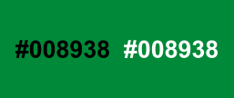
The RGB hex value #008938 will give sufficient contrast against both white and black.
Examples
Green #007B35 on light blue #D0DBE3 is only 3.8:1.
Darkening the text to #216641 will give a 5:1 ratio.
![]()
Black #011D07 on green #007F36 is only 3.5:1.
Lightening the green to #3D825D will work for both the green and black text.
How to check contrast
It can be tricky to install a colour contrast checker on Defra laptops.
If you can install some software, try Colour Contrast Analyser.
If you cannot install, you can test text on an image using this text on background image a11y check.
Correct colour contrast ratio depends on the text size. As your image will be displayed at a number of different sizes (for example on mobile) we suggest that you use the ratio for ‘regular’ text which is 4.5:1.
False bold or italic or special fonts
Use only the default font. Do not use false (faux) bold or italic or special fonts.
Example:
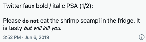
A user will hear “Please eat the shrimp scampi in the fridge. It is tasty.”
Reason: it is possible to use ‘unicode’ to add characters you do not find on your keyboard, such as upside-down letters, Old English, or even bold or italic. These are not announced by screen readers and sometimes not rendered as you expect. Often the "italic" and "bold" are maths symbols. They often are read out, but as "mathematical symbol b" etc. They may also not appear when your tweet is read by other systems such as blogs.
Image alternative text
Add appropriate alternative (alt) text to every image you use.
Write your own alt text. Do not rely on any automated alt text.
You can use up to 1,000 characters in the alternative text.
Reason: people who cannot see the image, or where the image is not displayed cannot understand the content.
Write helpful alt text
If your image repeats some text, do not paste that text into the alt text. Work out what would give the best experience for the users.
Follow existing web guidelines. Use the W3C alt text decision tree as a starting point if you are uncertain what text to add. You do not need to say “image of” or “photo of”.
Alt text for decorative images
All images need alt text, even if they are considered ‘decorative’. If you don’t add alt text, Twitter for example adds “Image” as the alt text.
Some people say that ‘decorative’ images, chosen to complement an article, don’t need alt text. However, this excludes users who can’t see from accessing them.
Make sure alt text is interesting. If we write ‘drab or boring’ alt text then we do not replace the image for people who cannot see it. For example, for this image:

“Mosque roof” is dull and does not add much.
“A Mosque roof looking up from the inside with detailed geometric patterns in the roof structure and decoration” is better.
But maybe with more thought it can be integrated into the text flow:
“The beautiful Islamic geometric designs on this Mosque ceiling are believed to be the bridge to the spiritual realm, the instrument to purify the mind and the soul.”
Read also Text descriptions and emotion rich images by Leonie Watson.
Alt text for images that include people
At the time of writing (May 2022) there isn’t an agreed standard for how to write alt text about images that include people.
One view is that people who cannot see the image should have a full description of the image and that may include apparent gender, ethnicity/colour and age.
Another view is that it’s wrong for a tweet author to make assumptions about the person and include their apparent characteristics in the alt text.
Recommendations:
- If you are able to contact the person pictured, ask them to describe themselves.
- If you cannot contact the person, decide if their personal characteristics are important to the use of the image. If you think they are, then discuss the draft alt text with Defra blog editors.
Example images for discussion

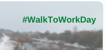
The alt text for this photo was “Anum Saleem”. Would it be more helpful as “Anum Saleem, a young woman wearing a grey Hijab”? Is this a reasonable or fair thing to do?
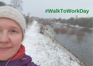
The alt text for this photo was “Image”. Would it be more helpful as “Selfie of Cathy Napier, a young white woman in warm winter clothes, on a snowy riverbank”? Is this a reasonable or fair thing to do?
Alt text on Twitter
Follow the general guidance for alt text above. These additional points apply to twitter.
If you leave the alt text empty for an image, Twitter adds “Image” as the alt text, so do not leave it empty.
Twitter only supports alternative text for static images and animated GIFs. You cannot add alternative text for videos (see video alternative text on Twitter below).
To add alt text on Twitter:
- When you add an image select ‘Add description’.
- Type the alt text text on the following screen.
- Press the ‘Apply’ button.
Video alternative text on Twitter
Twitter only supports alternative text for static images and animated GIFs. You cannot add alternative text for videos.
You will need to add alt text by:
- using a text in the tweet
- a reply tweet
- a link to a transcript (see tips for creating a transcript file on Google YouTube support)
Videos
If you choose to use video in your tweet, be certain that its use is justified.
The main concerns are to:
- avoid presenting content in a video that would be more accessible as plain tweet text or as static images - for example someone simply reading out a short announcement, or a slideshow of texts that could have been a thread
- avoid using bandwidth unnecessarily
- reduce the work needed to spread the information in the video because making video accessible can be time consuming
If so, be sure to include captions and audio description as necessary.
If your video only displays text, for example, audio description is necessary.
If that text is generally static but you feel the design is integral to the meaning, consider if it would be better represented with static images and appropriate alternative text instead.
Audio on Twitter
At the time of writing, Twitter’s announcement tweet has no transcript nor captioning so do not use it for Defra tweets.
If you use audio, use the regular tweet text as the transcript of the audio. Tell your users that the tweet is the transcript.
Reason: people who cannot hear clearly or choose not to have their sound on need a transcript.
Twitter theme colour contrast
Twitter’s default themes used to have terrible colour contrast. If you use a custom theme colour for your Twitter profile, check to see if your theme colour has good colour contrast.
Reason: with poor colour contrast some users will find it tricky to read your content.